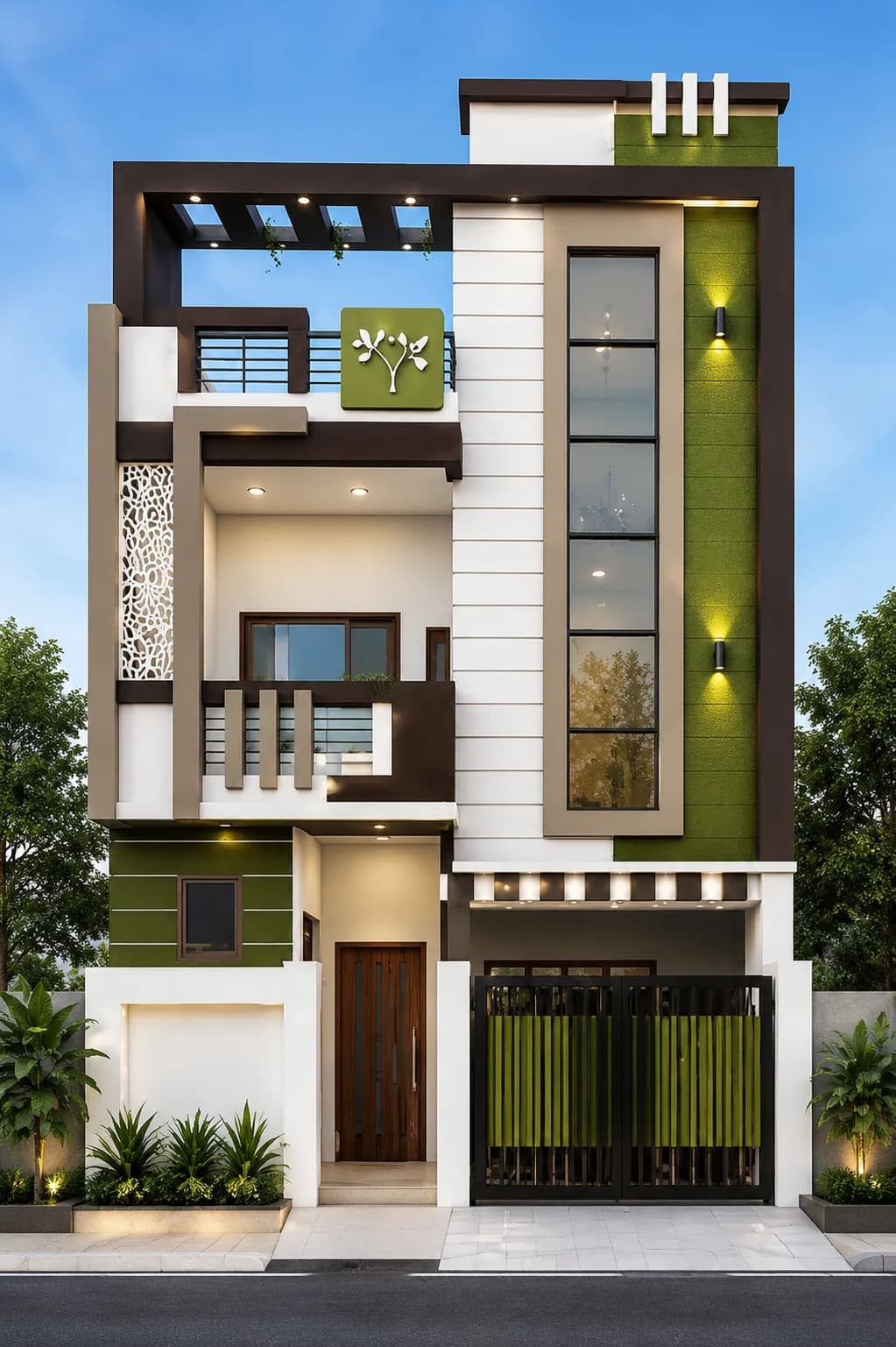
Choosing house colours from a small paint card is surprisingly difficult. A shade that looks quiet indoors can become much brighter across a sunlit exterior wall, while a dark colour that looked dramatic in a render may show dust or absorb more heat than expected.
Start with the parts of the house that are unlikely to change: stone, roof tiles, window frames, gates, paving and exposed concrete. The paint palette should connect those fixed elements rather than compete with them. Most modern elevations are easier to balance with one main colour, one contrast colour and a smaller accent.
01
White, charcoal and warm wood
This is one of the safest combinations for a clean modern elevation. White keeps the larger wall areas bright, charcoal gives window frames or balcony edges definition, and a wood-look finish warms the entrance or soffit. The wood tone works best as a limited accent; covering too many panels can make the facade feel busy.
If pure white feels difficult to maintain, move slightly towards warm white or a very pale grey. Keep the darkest colour away from every large sun-facing surface and use it where shadow and depth are already part of the design.
02
Cream, coffee brown and natural stone
Cream and brown suit homes that need warmth without a bright accent colour. They also sit comfortably beside beige, sandstone and many locally available stones. Use cream over the main walls, a deeper coffee or walnut shade on frames and selected panels, and let the real stone provide variation.
The risk is turning every surface into a similar mid-tone. A lighter base and a clearly darker detail usually create a cleaner result than several browns of almost equal strength.
03
Grey, white and black accents
Grey gives a modern house a calm, structured look and works well with white walls, black aluminium frames and warm exterior lighting. Pale or mid-grey is generally easier to use over a broad area; dark graphite is more effective on a stair tower, recessed balcony wall or narrow frame.
Cool grey can feel flat when the whole exterior uses the same value. Add depth through texture, a warmer stone, timber-toned entrance door or carefully placed lighting rather than introducing several unrelated colours.
04
Olive green, white and stone
Muted olive is a useful alternative to grey when you want colour without a loud facade. It works especially well with warm white, grey-beige stone and dark metal details. On a taller G+1 or G+2 elevation, olive can mark one vertical volume while the lighter colour keeps the building from feeling heavy.
Always test the exact green outside. Yellow sunlight, surrounding vegetation and nearby wall colours can shift how olive appears across the day.
05
Blue-grey, white and warm lighting
Blue-grey can make a contemporary facade feel more individual while remaining restrained. Pair it with white or a soft neutral rather than another strong cool colour. Warm lighting is particularly helpful at night because it prevents the palette from becoming visually cold.
Use the blue-grey on one feature wall, balcony band or upper-floor volume. A small sample viewed only in shade will not show how the colour behaves on a large wall in direct sun, so a proper outdoor test patch is worth the effort.
06
Let climate and maintenance narrow the choice
Very pale walls can show splash marks near the ground. Deep colours may reveal dust, fading or uneven repairs more readily. Strong rain exposure makes detailing, drainage and coating suitability just as important as the shade itself. Coastal locations also need careful material and fixing choices beyond paint colour.
Before buying the full quantity, paint a generous sample on more than one face of the building and check it in morning light, afternoon sun, shade and after dark. Confirm the coating system, surface preparation and recoat requirements with the paint manufacturer and your contractor.
Before you decide
Test the palette on the real elevation
- ✓Match paint to stone, windows, gates and paving already selected.
- ✓Limit the facade to one base, one contrast and one small accent.
- ✓View large outdoor samples in sun, shade and evening light.
- ✓Use darker colours where they strengthen the building’s form.
- ✓Consider dust, rain splash, fading and future touch-ups.
- ✓Confirm that every coating is suitable for the wall and exposure.
Common questions
Frequently Asked Questions
Which exterior colour combination is best for an Indian house?
There is no single best palette, but warm white with charcoal and wood tones, cream with brown and stone, and grey with white are versatile starting points. The right choice depends on the facade, fixed materials, local light, weather and maintenance.
How many colours should a modern house exterior use?
Two main colours and one limited accent are usually enough. Materials such as stone, glass, metal and wood-look panels also read as colours, so include them when judging the complete palette.
Is white practical for an Indian house exterior?
White can work well, but warm white or off-white may be easier to live with in dusty areas. Use a more forgiving finish near the base of the building and choose an exterior coating suited to the local exposure.